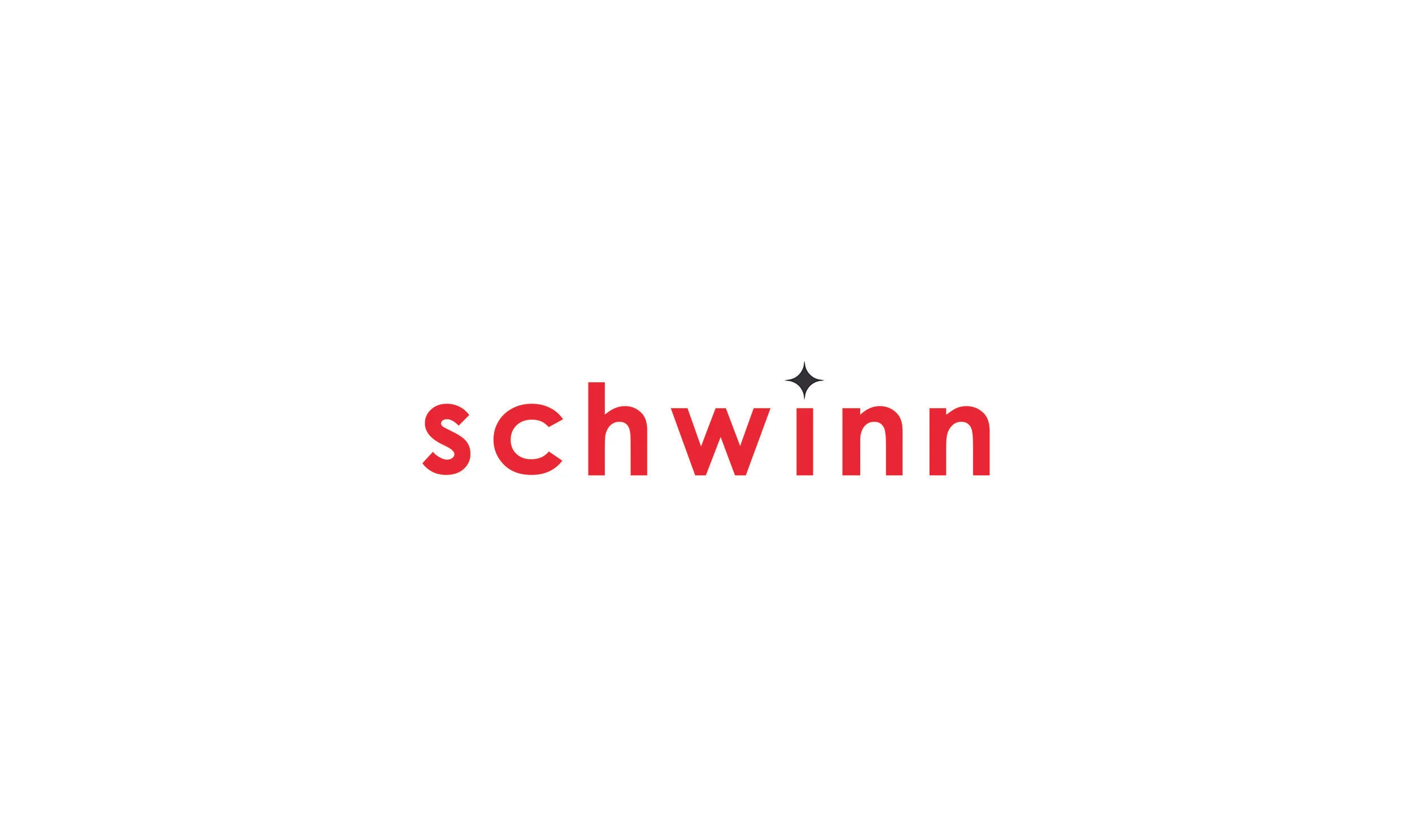
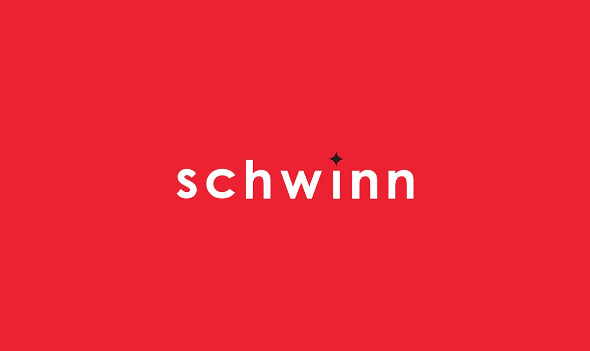
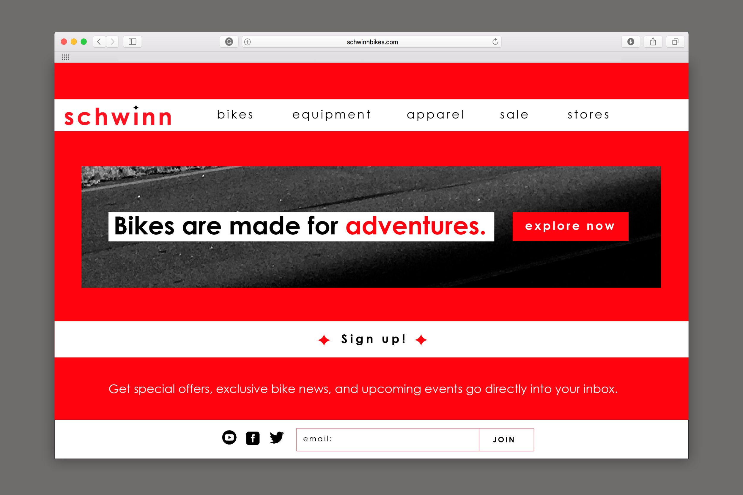
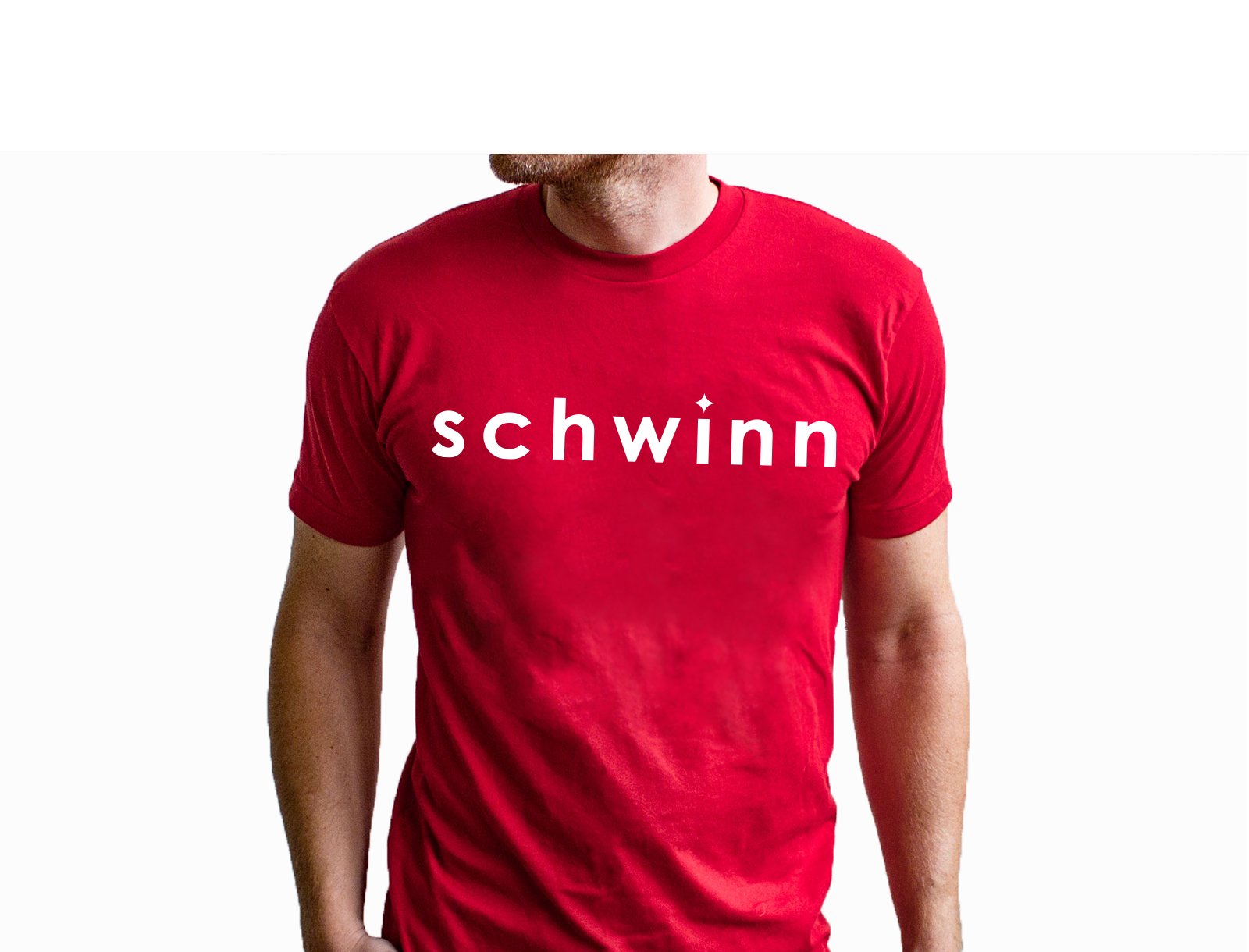
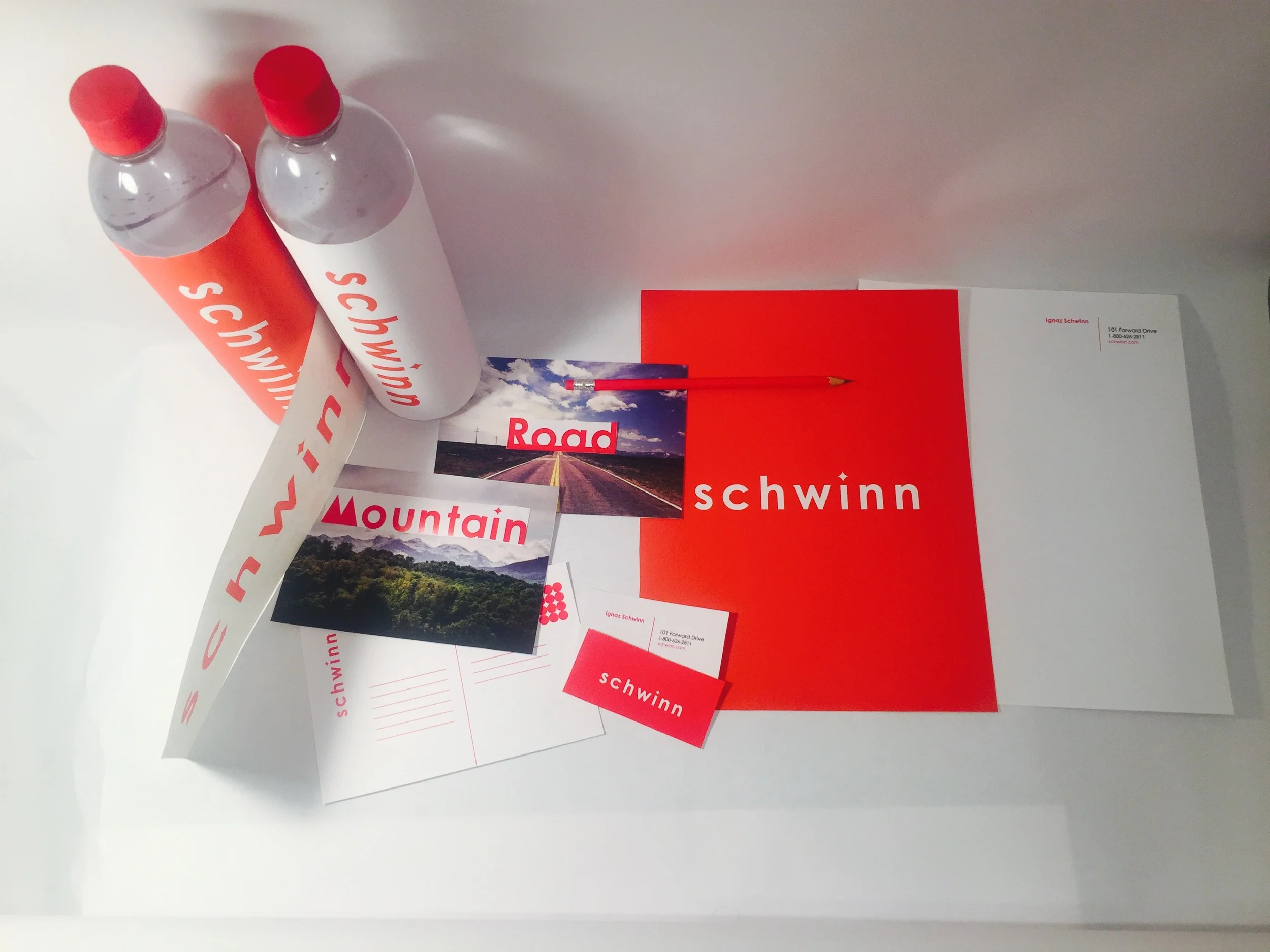
While Schwinn has continued to improve as a brand over the years, I noticed a lack of evolution in their logo. I wanted to explore how an updated logo would grow this classic brand. Taking the diamond symbol from their original logo, I used this diamond shape as the tittle in the “i” for the word mark. As diamonds connote quality so do Schwinn bikes. Click here to see the ideation and process of mark.
Before:
After:

